:format(webp)/cdn.vox-cdn.com/uploads/chorus_asset/file/12790147/202ewc5zpek7.1419964683.png)
Search is great when it comes to video, but how should a video service best show videos to users that they don't necessarily know they want to see? YouTube's recent redesign opted for a visually busy route, highlighting an ever-updating stream of video thumbnails in the center column and offering options to dig deeper and expand your subscription selections with the usual mix of popular, trending, and channels YouTube recommends based on your viewing practices.
Vimeo's new redesign, launching today as a closed test and codenamed "Project Aurelia," goes in the opposite direction, opting for a single feed showing videos from all the people and channels you follow. Similar to Tumblr's Dashboard, the new feed lets you play embedded videos without having to jump to the video's page. The site's navigation has been cleaned up and organized around Me, Videos, Explore, Tools, Help, and Upload. Loading any video page, then, offers a much wider default video experience — it spans the entire page — and only loads basic title and description data. Only when the user scrolls down the page will the new Vimeo design actually load likes and commenting data.
In addition to the redesigned front page, Vimeo's other big new feature is the +video tag hanging down on the top right of each video page. Related videos, recently viewed, your personal feed, and your Watch later feed have all been taken from modules that usually appear below or beside the video and placed in this new dropdown. It definitely makes for a cleaner page — many video pages on the web are a cluster of thumbnails enticing users to keep clicking — but the tag may be hard to notice for first-time users.
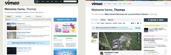
You'll see the two homepages compared above, and for users worried about too much change, the new design still looks and feels like Vimeo. More importantly, it generally feels faster, even though it's still in testing. There's a lot more here too, including bulk video uploads, better privacy controls over activity feed visibility and video states, improved search, and for the pros: keyboard commands. Vimeo plans to open sign-ups in the coming weeks for access, so check in here to apply.
:format(webp)/cdn.vox-cdn.com/uploads/chorus_asset/file/2586612/Clip_Page.1327411071.png)
:format(webp)/cdn.vox-cdn.com/uploads/chorus_asset/file/2586608/clip_page_with_comments.1327411066.png)
:format(webp)/cdn.vox-cdn.com/uploads/chorus_asset/file/2586610/Brozar_Clip_Page.1327411067.png)
1/3
:format(webp)/cdn.vox-cdn.com/uploads/chorus_asset/file/25288449/246992_AI_at_Work_BORING_ECarter.jpg)
:format(webp)/cdn.vox-cdn.com/uploads/chorus_asset/file/25288452/246992_AI_at_Work_REAL_COST_ECarter.png)
:format(webp)/cdn.vox-cdn.com/uploads/chorus_asset/file/25284882/246992_AI_at_Work_BUSYWORK_ECarter.jpg)
:format(webp)/cdn.vox-cdn.com/uploads/chorus_asset/file/25284881/246992_AI_at_Work_HISTORIANS_ECarter.jpg)